|
The artwork before you is the artwork of myself, David Spoone. This type of artwork I made is called double exposure self-portrait. The artwork was created during the span of two days from May 2nd to May 4th 2016. The 1st piece of art I used neutral colors with a brownish colored paper as a background. The imaged you can see through me is a graveyard with a church behind it. The movement I tried to make is from my eyes looking down to the hat which leads you to see the graves. The two to main points of emphasis was the hat and my eyes. Both of which work together with me bowing my head that makes it look like I'm praying. The story I'm trying to convey to the audience is the feeling of losing someone. The story that my artwork represents losing my pastor Brother Love. When I was born my mother had lost her father a short while after, so I also loss my Poppy. I never knew him truly,but I do know that he was a great man who would always tried to help others. I grew up never knowing him, but Brother Love was like a guardian to me and the entire church. The church was like family to me. Recently Brother Love had passed away, and I can't forget that feeling of loss. After the funeral the funeral we had moved him to his grave and buried him which happened to be right next to my Poppy's grave. Let's say that didn't help with the flow of emotions that day. That is what my artwork means to me. My personal judgement on the artwork would say it's a great success. The pose I made felt and looked powerful and yet humble in prayer at the same time. The graves with the church showed that it was truly about loss. This was an original piece of work made by myself and I hope you liked what I made.
0 Comments
Katie Lewis created a great game that was interesting and very helpful if you were studying the elements of art. For each level she had semi-challenging enemies blocking you from your objective, studying the elements of art, and finishing the game. Plus she added more than one way to die in a level; however, this could discourage some people to stop playing the game fully. One of her mistakes in the game as I looked over it was that with her definitions she didn't put the right definitions for some words. I.E. "Color- the most exciting part about art." Overall I give her game an eight.
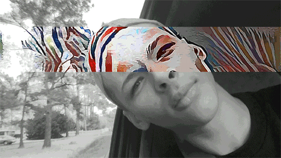 I like this photo because of its multiple filters it has. Plus the most of filters don't focus entirely on the face which most would've done. Instead it applies filters to the background. Also this image applies that he's in motion in a car which adds a nice effect as well.
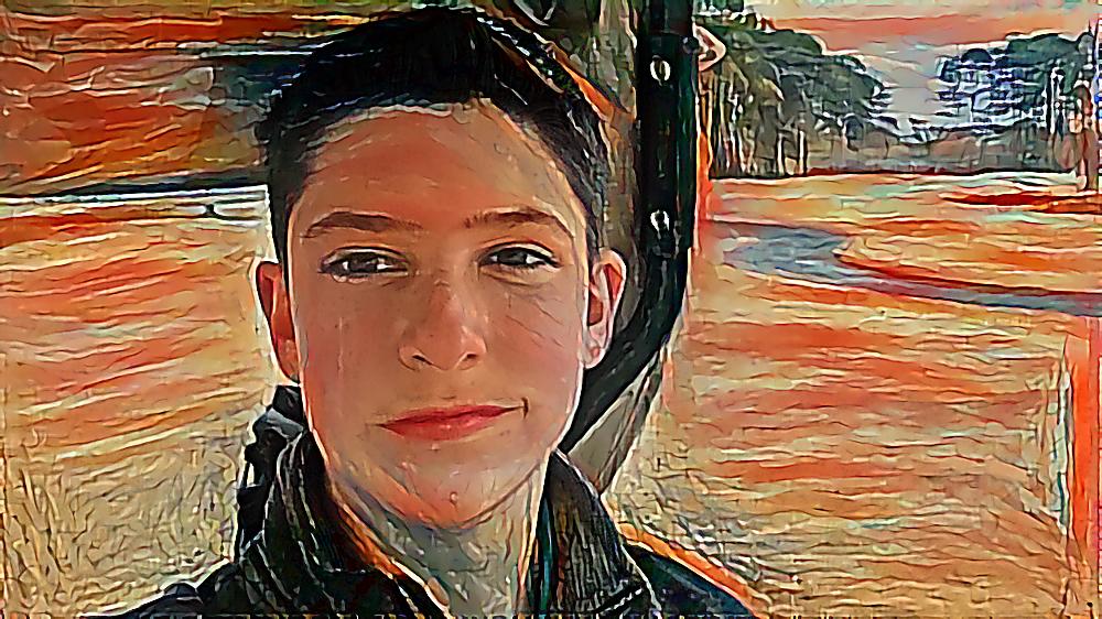 This is probably one of the few pictures I've edited and like the outcome of it. I was taking this while enjoying time with family, which is always nice. The filter, The Scream, played really well with what I was trying to do. Just like in the original drawing of the Scream the art design portray depth of field very nicely. And with the background you can see trees, mounds, and what appears to be a stream very clearly.
|
Author
Archives
May 2016
Categories |


 RSS Feed
